The Importance of Data Visualization (Datasaurus Edition)
The tutorial uses {data.table} and anonymous body notation, an advanced R programming technique. Computing the summaries would be a pain otherwise.
Don’t worry if you don’t understand the code, the key message of this tutorial is communicated with the diagrams and the text.
Overview Link to heading
Data visualization is an incredibly important component of a data scientist’s toolbox. Not just for communicating the results of an analysis, but also as a sanity check for detecting obvious problems with the data.
The original Datasaurus was created by Alberto Cairo in 2016 as a humorous demonstration of how a silly image can be presented as a serious dataset. Justin Matejka und George Fitzmaurice later published a technique that could produce “serious” datasets from a wide range of base images, resulting in the Datasaurus Dozen.
This tutorial discusses the Datasaurus with its dozen companion examples and explores how they illustrate the limitations of raw data inspection and pure summary statistics.
Table of Contents Link to heading
Load Packages Link to heading
1library(datasauRus) # Datasaurus Dataset
2library(ggplot2)    # Dataviz
3library(ggdark)     # Dark Theme for ggplot2
4library(data.table) # Data wrangling
The Datasaurus Link to heading
The Datasaurus was created by Alberto Cairo in 2016 to demonstrate that even an obviously silly dataset can appear serious and mathematically precise when only the numbers are presented or summary statistics are computed.
Justin Matejka and George Fitzmaurice later extended the Datasaurus with a dozen companion datasets (Matejka and Fitzmaurice 2017). Rhian Davies collected these thirteen datasets (the Datasaurus plus its Dozen) in the {datasauRus} package.
We’ll get to the numbers in a moment. Let us begin by plotting the Datasaurus. I first convert the dataset from the {datasauRus} package to a data.table, then plot the Datasaurus with {ggplot2} .
1dt <- datasaurus_dozen
2setDT(dt)
3
4ggplot(dt[dataset == "dino"],
5       aes(x = x,
6           y = y)) +
7    geom_point() +
8    dark_theme_bw()
1## Inverted geom defaults of fill and color/colour.
2## To change them back, use invert_geom_defaults().
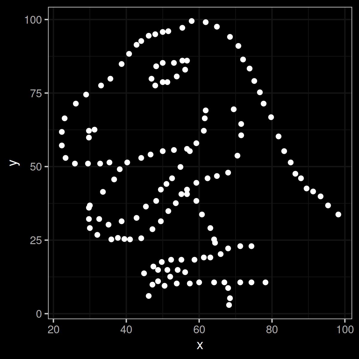
Figure 1: The Datasaurus in all its gory data glory. Rawr.
Very Serious Numbers Link to heading
The Datasaurus is obviously no dataset that encodes serious empirical information or any kind of other useful data. But you could never tell if you didn’t plot it. If you only looked at the numbers that make up the dataset, they would look very serious and very professional:
1print(dt[dataset == "dino"])
 1##      dataset       x       y
 2##       <char>   <num>   <num>
 3##   1:    dino 55.3846 97.1795
 4##   2:    dino 51.5385 96.0256
 5##   3:    dino 46.1538 94.4872
 6##   4:    dino 42.8205 91.4103
 7##   5:    dino 40.7692 88.3333
 8##  ---
 9## 138:    dino 39.4872 25.3846
10## 139:    dino 91.2821 41.5385
11## 140:    dino 50.0000 95.7692
12## 141:    dino 47.9487 95.0000
13## 142:    dino 44.1026 92.6923
The Datasaurus Dozen Link to heading
Now let us look at the dozen companion datasets of the Datasaurus. As above, I use the data.table object we created and remove only the Datasaurus to make it a clean dozen that can easily be placed in a 3x4 grid.
The only major addition to the code above is facet_wrap(~dataset, ncol = 4), which creates a grid by dataset.
As with the Datasaurus, these diagrams have great aesthetic value, but contain no useful empirical content.
1ggplot(dt[dataset != "dino"],
2       aes(x = x,
3           y = y)) +
4    geom_point() +
5    dark_theme_bw() +
6    facet_wrap(~dataset, ncol = 4) # Plot the different datasets in a grid
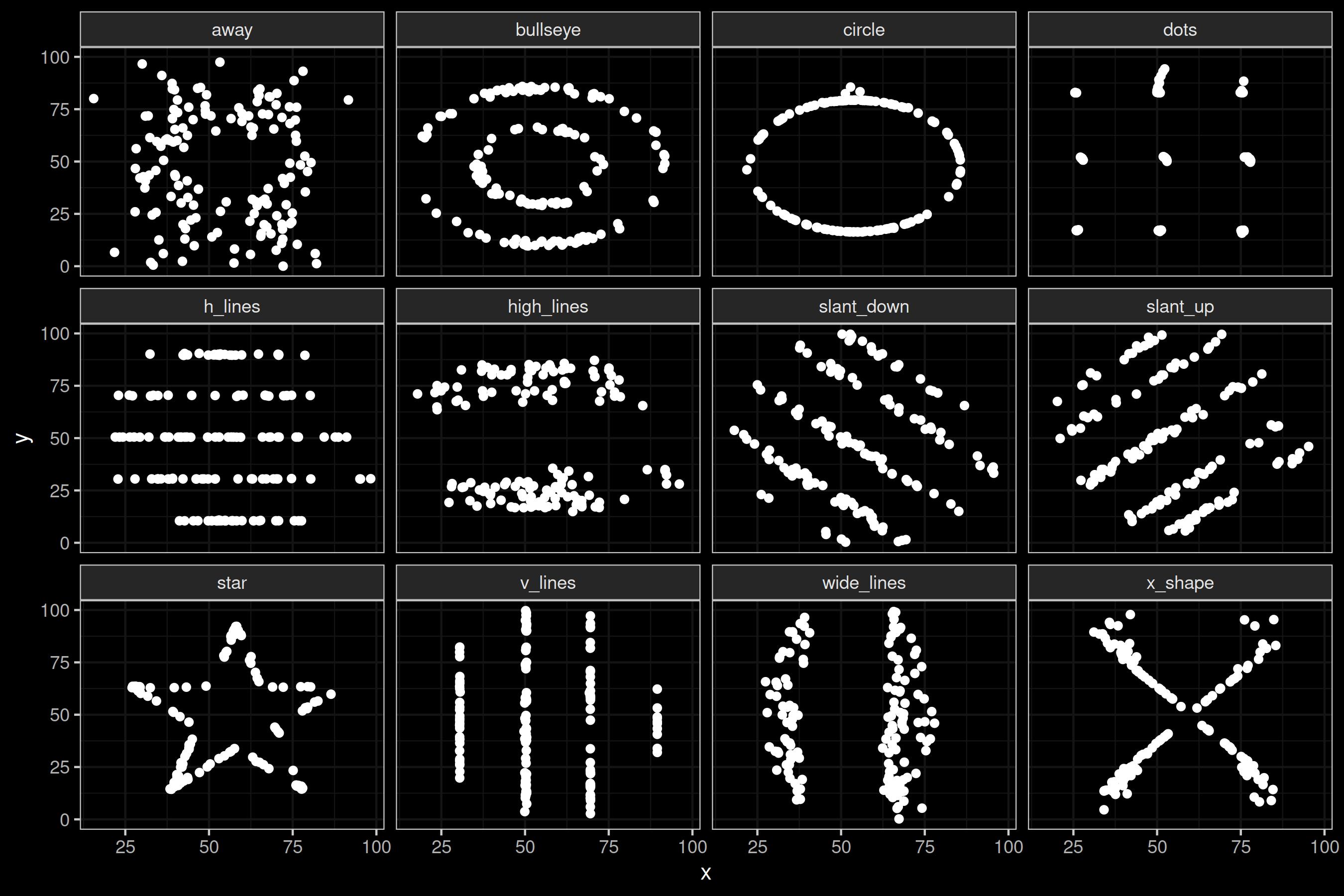
Figure 2: The Datasaurus Dozen.
Identical Summary Statistics Link to heading
So far this has been an exercise in optics, but where it gets really interesting is when calculating the summary statistics. The mean, standard deviation and correlation are almost identical for all thirteen datasets!
Don’t believe me? Let’s run the math.
1dt[,{
2    x_mean  <- mean(x)
3    x_sd <- sd(x)
4    y_mean <- mean(y)
5    y_sd <- sd(y)
6    corr <- cor(x, y)
7    list(x_mean, x_sd, y_mean, y_sd, corr)
8}, by = "dataset"]
 1##        dataset   x_mean     x_sd   y_mean     y_sd        corr
 2##         <char>    <num>    <num>    <num>    <num>       <num>
 3##  1:       dino 54.26327 16.76514 47.83225 26.93540 -0.06447185
 4##  2:       away 54.26610 16.76982 47.83472 26.93974 -0.06412835
 5##  3:    h_lines 54.26144 16.76590 47.83025 26.93988 -0.06171484
 6##  4:    v_lines 54.26993 16.76996 47.83699 26.93768 -0.06944557
 7##  5:    x_shape 54.26015 16.76996 47.83972 26.93000 -0.06558334
 8##  6:       star 54.26734 16.76896 47.83955 26.93027 -0.06296110
 9##  7: high_lines 54.26881 16.76670 47.83545 26.94000 -0.06850422
10##  8:       dots 54.26030 16.76774 47.83983 26.93019 -0.06034144
11##  9:     circle 54.26732 16.76001 47.83772 26.93004 -0.06834336
12## 10:   bullseye 54.26873 16.76924 47.83082 26.93573 -0.06858639
13## 11:   slant_up 54.26588 16.76885 47.83150 26.93861 -0.06860921
14## 12: slant_down 54.26785 16.76676 47.83590 26.93610 -0.06897974
15## 13: wide_lines 54.26692 16.77000 47.83160 26.93790 -0.06657523
Almost identical! All of them!
If you had seen only the summary statistics, you might have reasonably, but wrongly (!), concluded that the dinosaur dataset is identical to the star dataset or the bullseye dataset or any of the others. You might have also concluded that the data could tell you something about the world, which it probably doesn’t.
Identical Linear Regression Lines Link to heading
Linear regression is a predictive modeling technique that, informally speaking, attempts to draw a line that best fits the dataset and minimizes the distance between itself and every point in the dataset. It is an incredibly common technique used in many disciplines on its own (e.g. medicine, psychology) or as a component of more complex techniques (e.g. neural networks in machine learning).
Let us redraw the plot from above, but add a linear regression line. I’ll stick to the visual regression lines and omit the equations, in the interest of not overloading the tutorial.
1ggplot(dt[dataset != "dino"],
2       aes(x = x,
3           y = y)) +
4    geom_point() +
5    geom_smooth(method = "lm")+
6    dark_theme_bw() +
7    theme(legend.position = "none") +
8    facet_wrap(~dataset, ncol = 4) # Plot the different datasets in a grid
1## `geom_smooth()` using formula = 'y ~ x'
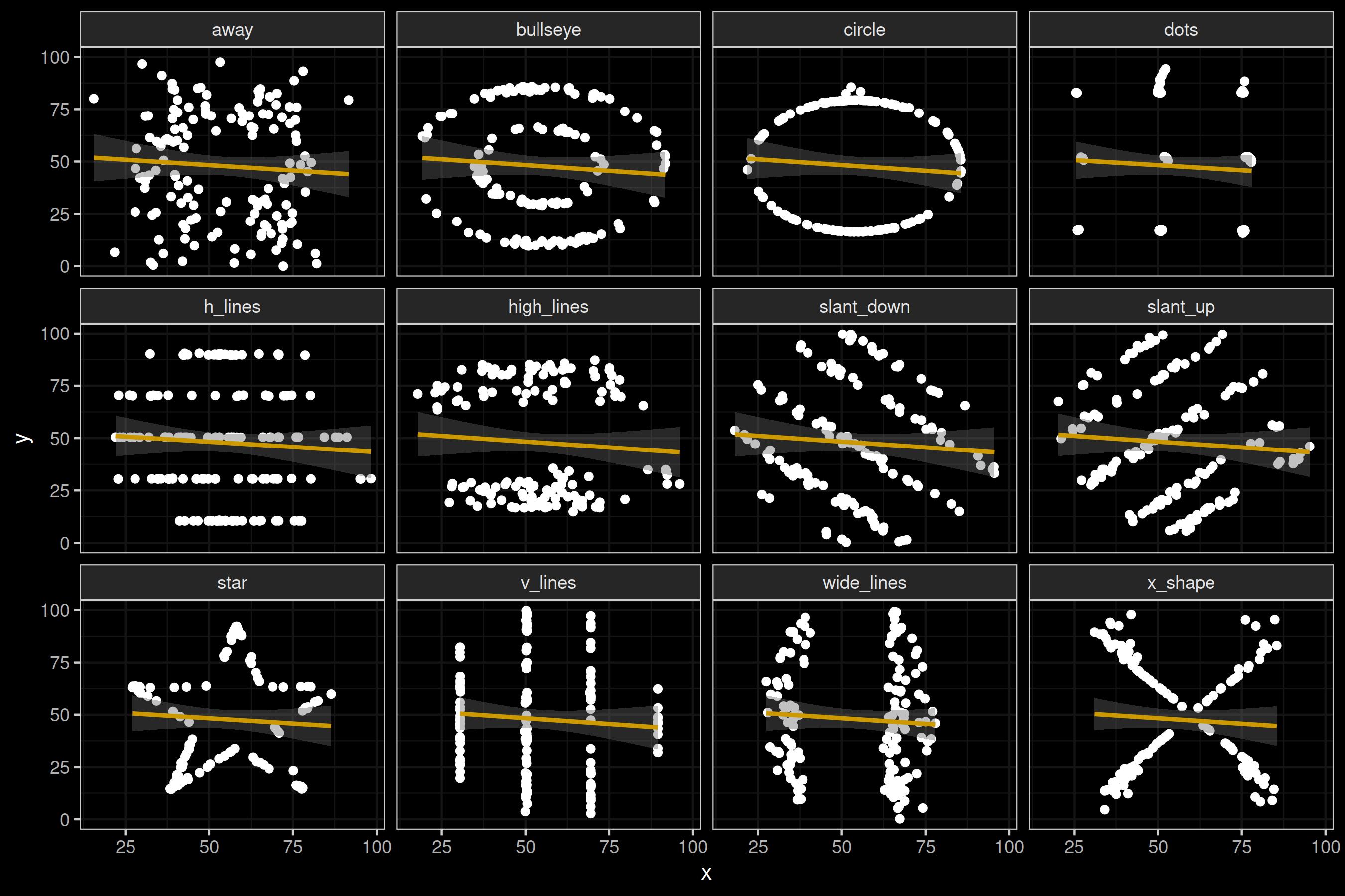
Figure 3: The Datasaurus Dozen with regression lines.
Again, the line is pretty much identical for all datasets. What does this mean? If you trained a prediction model with linear regression based on any of these datasets, it could equally well explain any of the other datasets.
In other words: just because you can draw a straight line does not mean that a model based on a straight line is a good idea. That being said, training a fancy neural network on this data would not do you any good either.
The Inspiration: Anscombe’s Quartet Link to heading
The Datasaurus was inspired by Anscombe’s Quartet, a famous teaching dataset created by Francis Anscombe in 1973. It was created with much the same teaching purposes in mind, but no one knows how Anscombe come up with it, so the reproducible techniques presented by Matejka and Fitzmaurice (2017) were a welcome development.
Anscombe’s Quartet is part of base R. You can load it with the command anscombe.
1## Calculate Linear Models for Anscombe Data
2lm(anscombe$y1 ~ anscombe$x1)
3lm(anscombe$y2 ~ anscombe$x2)
4lm(anscombe$y3 ~ anscombe$x3)
5lm(anscombe$y4 ~ anscombe$x4)
 1## Grid
 2par(mfrow=c(2,2), pch = 19)
 3
 4## Plot Individual Anscombe Datasets
 5plot(anscombe$x1, anscombe$y1, xlab = "x", ylab = "y", xlim = c(2,20), ylim = c(2,14))
 6abline(lm(anscombe$y1 ~ anscombe$x1))
 7
 8plot(anscombe$x2, anscombe$y2, xlab = "x", ylab = "y", xlim = c(2,20), ylim = c(2,14))
 9abline(lm(anscombe$y2 ~ anscombe$x2))
10
11plot(anscombe$x3, anscombe$y3, xlab = "x", ylab = "y", xlim = c(2,20), ylim = c(2,14))
12abline(lm(anscombe$y3 ~ anscombe$x3))
13
14plot(anscombe$x4, anscombe$y4, xlab = "x", ylab = "y", xlim = c(2,20), ylim = c(2,14))
15abline(lm(anscombe$y4 ~ anscombe$x4))
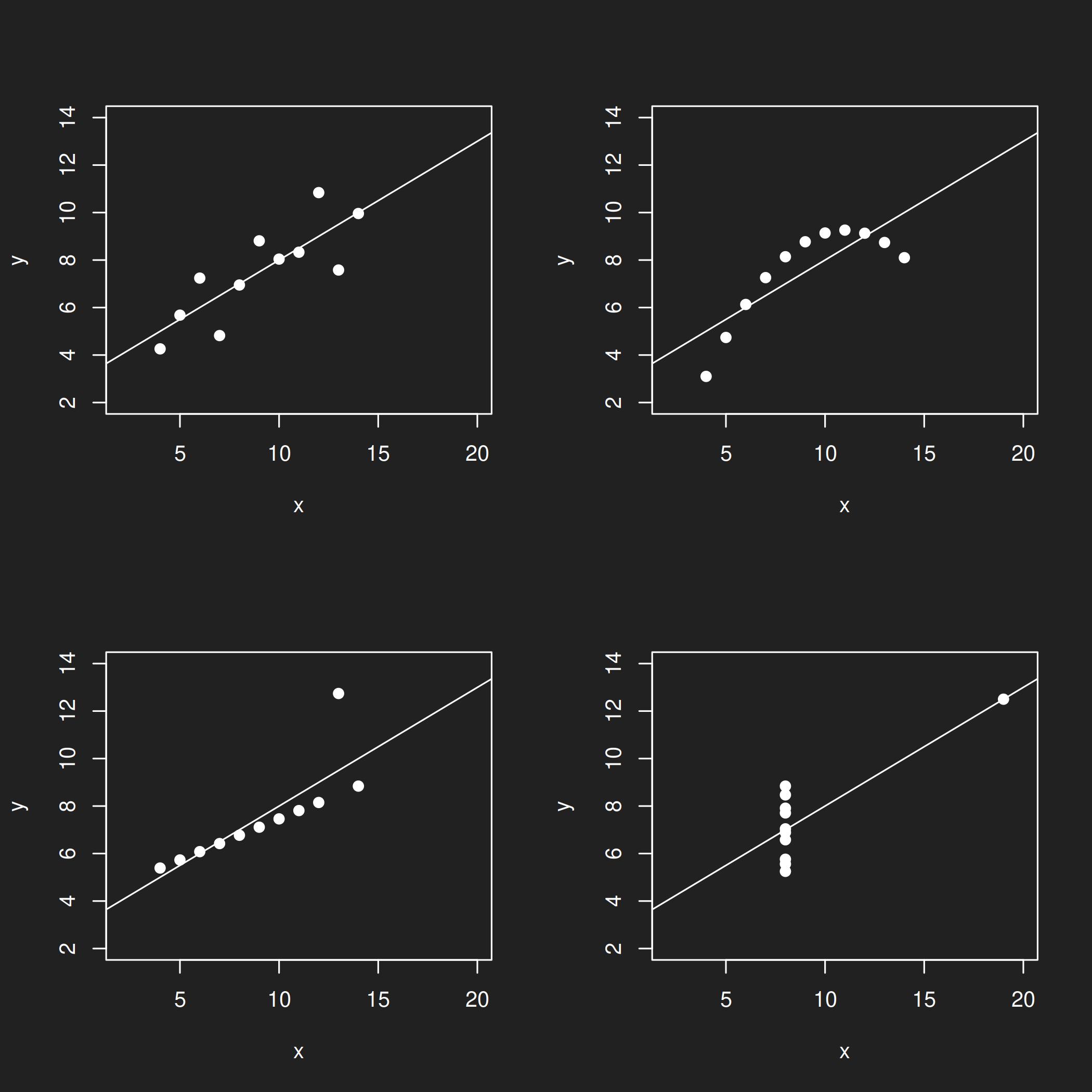
Figure 4: Anscombe's Quartet.
Conclusion Link to heading
Raw numbers can hide many things. Summary statistics can provide you with a first overview of a dataset, but in their simplicity they can be as misleading as they are helpful.
You will not often encounter intentionally manufactured datasets like these in the wild unless you happen to be in the business of reviewing academic misconduct or were the victim of a prank, but real-world datasets may have any number of properties that you were not expecting.
Bear in mind:
- Raw data hides many things
- Summary statistics can be misleading
- Data visualization can help detect data quality issues, anomalies and uncommon distributions
In conclusion: Always. Visualize. Your. Data.
Replication Details Link to heading
This tutorial was last updated on 2026-03-16.
1sessionInfo()
 1## R version 4.2.2 Patched (2022-11-10 r83330)
 2## Platform: x86_64-pc-linux-gnu (64-bit)
 3## Running under: Debian GNU/Linux 12 (bookworm)
 4##
 5## Matrix products: default
 6## BLAS:   /usr/lib/x86_64-linux-gnu/openblas-pthread/libblas.so.3
 7## LAPACK: /usr/lib/x86_64-linux-gnu/openblas-pthread/libopenblasp-r0.3.21.so
 8##
 9## locale:
10##  [1] LC_CTYPE=en_US.UTF-8       LC_NUMERIC=C
11##  [3] LC_TIME=en_US.UTF-8        LC_COLLATE=en_US.UTF-8
12##  [5] LC_MONETARY=en_US.UTF-8    LC_MESSAGES=en_US.UTF-8
13##  [7] LC_PAPER=en_US.UTF-8       LC_NAME=C
14##  [9] LC_ADDRESS=C               LC_TELEPHONE=C
15## [11] LC_MEASUREMENT=en_US.UTF-8 LC_IDENTIFICATION=C
16##
17## attached base packages:
18## [1] stats     graphics  grDevices datasets  utils     methods   base
19##
20## other attached packages:
21## [1] data.table_1.16.0 ggdark_0.2.1      ggplot2_3.5.1     datasauRus_0.1.8
22##
23## loaded via a namespace (and not attached):
24##  [1] highr_0.11        bslib_0.8.0       compiler_4.2.2    pillar_1.9.0
25##  [5] jquerylib_0.1.4   tools_4.2.2       digest_0.6.37     lattice_0.20-45
26##  [9] nlme_3.1-162      jsonlite_1.8.8    evaluate_0.24.0   lifecycle_1.0.4
27## [13] tibble_3.2.1      gtable_0.3.5      mgcv_1.8-41       pkgconfig_2.0.3
28## [17] rlang_1.1.4       Matrix_1.5-3      cli_3.6.3         yaml_2.3.10
29## [21] blogdown_1.19     xfun_0.47         fastmap_1.2.0     withr_3.0.1
30## [25] dplyr_1.1.4       knitr_1.48        generics_0.1.3    sass_0.4.9
31## [29] vctrs_0.6.5       grid_4.2.2        tidyselect_1.2.1  glue_1.7.0
32## [33] R6_2.5.1          fansi_1.0.6       rmarkdown_2.28    bookdown_0.40
33## [37] farver_2.1.2      magrittr_2.0.3    splines_4.2.2     scales_1.3.0
34## [41] htmltools_0.5.8.1 colorspace_2.1-1  renv_1.0.7        labeling_0.4.3
35## [45] utf8_1.2.4        munsell_0.5.1     cachem_1.1.0