Representativeness, Samples and Populations
Overview Link to heading
The representativeness of scientific research and public opinion polls is one of the defining methodological problems of our time. Whether a single study or a series of studies provide us with general information about the world greatly depends on the quantity and quality of the data collected.
If the methods and data of a study are rigorous and convincing in its own context we call it internally valid. If the methods and data allow us to generalize these results to a wider population we call it externally valid.
Key components of external validity are samples, populations and representativeness. Properly drawn random samples with adequate sample size allow inferences from a thousand persons to an entire country. By contrast, badly drawn samples are often biased in unknown and irreparable ways. The quality and quantity of the sampling process are key to the power of modern opinion polls, which are able to predict the outcome of democratic elections within a margin of just a few percentage points.
However, these results are only helpful when the methods are rigorous. The reliance on flawed data in decisionmaking can cause significant and widespread damage. Nowhere is this more acute than in public policy and the application of the law. It is critical for lawyers to understand when results can be generalized and when they cannot.
This tutorial examines the following themes:
- The difference between descriptive and inferential statistics
- Samples, populations and representativeness as key concepts
- The reference class problem as a PR catastrophe for the Munich Security Conference
- Fixing the reference class problem with random sampling or post-stratification
- Biased opinion polling and the downfall of the Literary Digest
- Visual intuition for random samples
- Numerical intuition for random samples
- The bootstrap procedure for measuring uncertainty at different sample sizes
This tutorial is rather heavy on theory in the first half, but the second half includes a lot of interesting R code you can run yourself. You’ll learn to understand the process, verify the results and make some cool diagrams. The visuals in particular are far more exciting when you create them yourself!
I recommend using WebR for this tutorial.
WebR is a web application that runs directly in your browser and executes R code locally in a sandbox on your machine, not in the cloud. You do not have to install anything.
Of course you can also execute the code from the tutorial in a local integrated development environment (IDE) such as RStudio or in the cloud, for example with Posit Cloud.
Table of Contents Link to heading
Samples and Populations Link to heading
Statistical methods are often divided into two major areas:
- Descriptive Statistics
- Inferential Statistics
Descriptive statistics is about describing the world in terms of data that was actually collected. It includes methods of analysis and reduction to transform mountains of data into summaries that can be understood and interpreted by humans. Classical descriptive statistical methods include the computation of distributions and summary statistics that result in numerical summaries (like the arithmetic mean, also known as the average) or visual overviews (such as histograms or density charts).
Inferential statistics is about inferring information that goes beyond the specific data collected. It takes up the central challenge of the natural and social sciences: how can we acquire general insights about the world and its inhabitants even though it is often impossible to collect all the data relevant to a specific research question? The foundations of inferential statistics are the subject of this tutorial.
Statistics as a discipline, inferential statistics in particular, developed from a desire to improve agriculture. Many pioneering statisticians wanted to efficiently research farming techniques (fertilizers, irrigation, plant breeding) in order to understand how to increase crop yield and other useful characteristics of plants.
Ronald Aylmer Fisher, the father of modern statistics, spent one of the most productive periods of his career at Rothamsted Experimental Station, where he made a name for himself studying arable crops. William Sealy Gosset (best known under his pseudonym “Student”) was Head Brewer and Head Experimental Brewer of the Guinness Brewery in Ireland and developed the famous t-test (Student 1908) to increase the yield of barley and brew better beer. The discipline of statistics has been strongly influenced by this link with agrarian and bio scientific research questions.
That being said, the most famous application of inferential statistics in modern times is the opinion poll. In democracies it is of significant theoretical and practical importance to be able to estimate the changing opinions of the population between elections and to react them in a timely fashion . However, it would be prohibitively expensive to poll every single citizen for every question. But how do we estimate the opinion of a population without polling the entire population?
Solving this problem requires knowledge of two fundamental concepts:
- Population — the set of all units relevant to a specific statistical research question. This could be the entire population of country, all the frogs in a pond, all products in a factory or all archaeological sites in a geographic region.
- Sample — a subset of the population under consideration. Samples can be drawn in many different ways and some methods are much better and some much worse than others. Random samples are usually the ideal sampling methodology. Convenience samples are usually the worst.
Terminology: Statistical Populations
In statistics the term “population” does not necessarily refer to the population of a country, that is, a population of humans. It is perfectly acceptable and quite routine to analyze populations of objects, animals, viruses or anything else worth studying. So whenever you see “population” in a statistical context, it roughly means “the set of all relevant things”.
A complete examination of an entire statistical population is usually too expensive, quite unethical (think invasive medical studies) or simply impossible (e.g. not all members of the population are known). There are exceptions where it is possible to study the whole population. For example, in the context of peace research we know all countries in the world and (probably) know of all or almost all armed conflicts since 1945.
The primary goal of inferential statistics is to link a sample and population. A well-drawn sample allows us to infer some characteristics of the population it was drawn from, albeit with a some uncertainty that varies with the size of the sample and the sampling methodology.
Terminology: Parameter and Statistic
Whenever you compute something from a sample (e.g. the mean), it is called a “statistic” (singular). If you compute something from a population it is called “parameter”. The goal of inferential statistics is to infer a parameter from a statistic.
The Reference Class Problem Link to heading
Learning something about a population from a sample is only possible if the sample was well drawn. In the news we are often told that a sample is “representative”. But what does “representative” mean?
Speaking generally, a sample is only representative if it corresponds to the population in all relevant characteristics. We know many examples from daily life where this is not the case and we feel something is off.
For example, we know that the share of men and women in the population of most countries is approximately 50/50. So when we see a photo of a CEO lunch at the 2022 Munich Security Conference (MSC) with zero women participants, it is painfully clear that this is no representative sample of any national human population.
Yet how do we know which characteristics are relevant to our research question? Assume we poll a sample of the population and ask them which party they will vote for in the next general election. How do we find the correct proportion of model train enthusiasts, artists, marathon runners, and potters? Although maybe pottery and model train enthusiasm are not relevant? How can we know?
The truth is, for most research questions we simply do not know the set of relevant characteristics that would make a good sample and we have no way of finding out.
This is the essence of the reference class problem.
The reference class problem states that there is an infinite number of categories that can be applied to humans, objects, events and anything else in this world worth researching.
People can be lawyers, programmers, parents, mushroom gatherers, young, sick, athletic, political party members, leaders, followers, foreigners, citizens and many, many other things at various points in their lives. Often they are many of these at the same time!
The correct selection of relevant characteristics (or reference classes) from this multitude is what the reference class problem is about. Often enough the set of all relevant reference classes is unknown and unknowable.
Related problems in the field of human rights are multiple discrimination and intersectionality. In discrimination cases it is possible that multiple characteristics are the source of multiple discriminations. For example, a person might be discriminated against in daily life for being non-white in one situation, then be discriminated against in another situation for being a member of a sexual minority (multiple discrimination). However, being a non-white member of a sexual minority might also lead to unique cases of discrimination that are not experienced by persons with either of those characteristics alone (intersectionality).
Randomization and Post-Stratification as Solutions to the Reference Class Problem Link to heading
There are two types of solutions that can solve the reference class problem and produce representative samples:
- Random selection of units (random sample)
- Weighting, quotas or statistical control of characteristics (pre- and post-stratification)
The random sample is the most elegant method to account for the reference class problem. If all units of a sample are drawn randomly from the population, then all characteristics are also randomly mixed, so each unit and each characteristic have the same probability of being included in the sample. This is why random sampling is often shortened to “iid” or “i.i.d.”, meaning “independent and identically distributed”. True random samples are the ideal method for establishing representativeness.
Pollsters in industrialized countries often call a random samples of telephone numbers (random digit dialing) to conduct their surveys. If this is not possible, cluster sampling or stratified sampling are good alternatives.
Cluster sampling randomly selects clusters of interest (e.g. certain neighborhoods) for interviews. This can be extended to multi-stage cluster sampling. In the second stage one might randomly select housing blocks from the first-stage neighborhoods. In a third stage one might again select individual houses or apartments from the housing blocks identified in the second stage.
Stratified sampling randomly selects units from different categories of the sampling frame. This is helpful when the research focuses on particular groups or the differences between specific groups.
True random samples are theoretically ideal, but difficult to acquire in practice. Usually there is no adequate list of all units in the population of interest or it might exist but is not available to researchers. In recent times, non-response bias has become a significant problem. Non-response rates of up to 90% in telephone surveys have been reported in the US, calling into question whether probability sampling has a future (Gelman and Hennig 2017).
Weighting, quotas or statistical control of characteristics are inferior to true random samples, but are often valuable where random samples are unobtainable. Were we to construct a “representative” guest list for a CEO lunch, we might attempt to achieve a quota of 50% women, 30% people of color, and so on, depending on the composition of a country’s population. Quotas can sometimes lead to odd results, but in many cases they are the only practical alternative.
These secondary approaches are problematic where not all relevant characteristics are known, the distribution of characteristics in the population is unknown or measurement is difficult. Unfortunately, these problems are the default for most research questions. This is why it is so difficult to generalize from non-random samples.
In academic research and political polling there have been many attempts to address this problem with complex statistical techniques. Statistical corrections require much knowledge about the field of research and its associated problems. In many cases these corrections are impossible or deeply misleading, if one is not careful.
In one promising example Wang et al. (2015) published a survey of Xbox players that was extremely large (N = 345,858) and deeply biased (93% male) but with certain statistical techniques (multi-level regression and post-stratification) they were able to achieve relatively good results in predicting the 2012 US Presidential election. Nevertheless, this remains an active area of research.
That being said, we’ll stick to random samples in this tutorial.
The Rise and Fall of the Literary Digest Link to heading
Now, this all sounds very abstract. Why is it so very important in practice how a sample was drawn? The story of the rise and fall of the Literary Digest shows how biased samples can not only lead to incorrect results but also how they can destroy a national reputation and ruin an entire enterprise.
The Literary Digest was a US American news magazine, published between 1890 and 1938. Starting in 1916 the magazine ran regular opinion polls in the run-up to US Presidential elections and always managed to correctly predict the winner — until 1936.
In 1936 the magazine distributed 10 million (!) straw polls and received 2.27 million (!) replies. A massive sample size that most researchers could only dream of, even in our modern age of big data. And this was in 1936! Based on this straw poll the Literary Digest declared Alfred Landon the likely winner of the Presidential election (55% Landon, 41% Roosevelt). Unfortunately, this was dead wrong.
Roosevelt won the Presidential election in a landslide victory of 61% to 37% in the popular vote and carried 46 of 48 states.1 The reputational damage was so immense that the Literary Digest never recovered and closed its doors in 1938.
What happened? The sample was not representative, but biased for two reasons:
- The response rate was only about 20% (non-response bias)
- Only certain segments of society were surveyed, mainly Digest readers and owners of automobiles and telephones (sample bias)
Response rate (non-response bias) is the one issue that all statistical commentators can agree on. 2.27 million responses to 10 million straw polls. If survey results are dominated by responses from the most motivated persons and this motivation is due to a special interest, then bias is to be expected. It would appear that the Digest poll drew its responses primarily from Landon supporters and Roosevelt opponents.
The presence of sample bias is more controversial, but remains a convincing reason. The survey apparently included only certain segments of the population, chief among them Literary Digest readers, automobile owners and telephone owners. At the time these were groups with above average income and therefore (probably) greater sympathies for Landon.
As in the Presidental election, the 1936 US polling saga had one clear loser and one clear winner. George Gallup, founder of the Gallup Organization, was able to correctly predict the winner of the 1936 election with a representative random sample of 50,000 participants — the advent of modern opinion polling.
Further Reading
If you’d like to learn more about the Literary Digest saga, Bryson (1976) and Squire (1988) provide good overviews. Kaplan, Chambers, and Glasgow (2014) discuss the limits of big data.
The reference section at the end of this post contains full citations and links.
A Visual Approach to Random Samples Link to heading
The drawing of samples, as abstract as it sounds, can be visualized and understood surprisingly well with only a few lines of code. In this section we discuss the function and advantages of true random samples compared to convenience samples (i.e. sampling whatever data you can get your hands on).2
The following section will build on this with a numbers-based approach to the same problem.
Generate an Artificial Population Link to heading
To establish a controlled ground truth for learning we will be working with an artificial statistical population with known features. We generate data for 1,000 hypothetical humans and we assume that they have only two characteristics: height and intelligence.
I have chosen these characteristics in particular because they are approximately normally distributed in the real human population, are widely known (even if not widely understood) in popular culture and because we can tell a little data story with them.
The population size of 1,000 is chosen purely because it is convenient for visualization purposes. As soon as we move on to work with numbers only we will choose a larger population size.
The precise distribution of features in the population is usually irrelevant for inferential statistics. Nevertheless, there are important exceptions.3 For a beginner-level tutorial I prefer to assume that the true population parameter follows a normal distribution, because it is visually and conceptually easier to understand than distributions.
Let us generate our data:
1height <- rnorm(1000, mean = 175, sd = 10)
2iq <- rnorm(1000, mean = 100, sd = 15)
3
4df.full <- data.frame(height, iq) # combine into a single table ("data.frame")
Distribution of Each Variable in the Population Link to heading
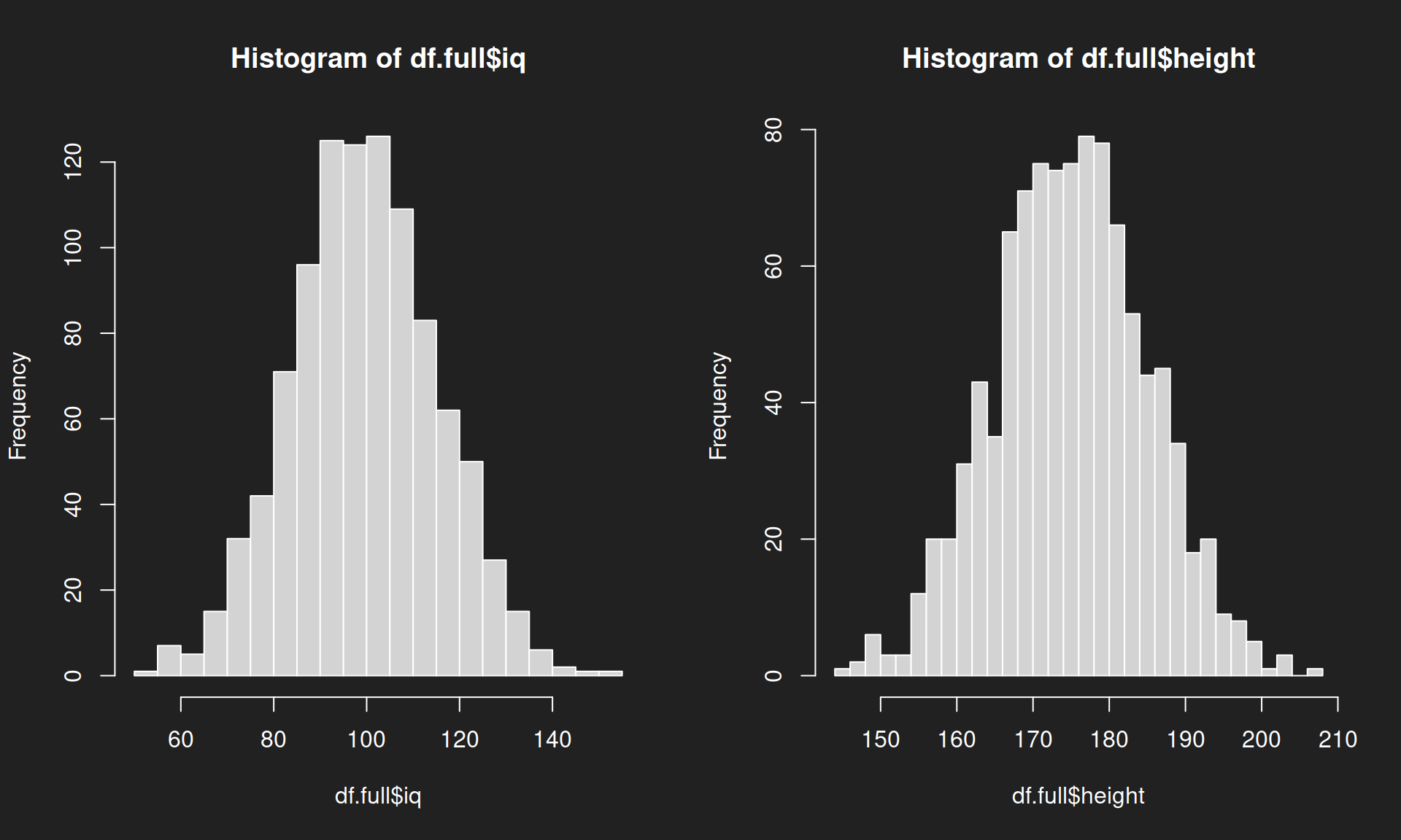
Let us recall and visualize the distribution of each of the variables in the population. We uncover the popular and widely known bell curve, the signature shape of the normal distribution.
df.full$iq means: select the variable “iq” from the data.frame “dt.full”.
1par(mfrow = c(1, 2)) # Display diagrams side-to-side
2
3hist(df.full$iq, breaks = 30)
4hist(df.full$height, breaks = 30)
Joint Distribution of Both Variables in the Population Link to heading
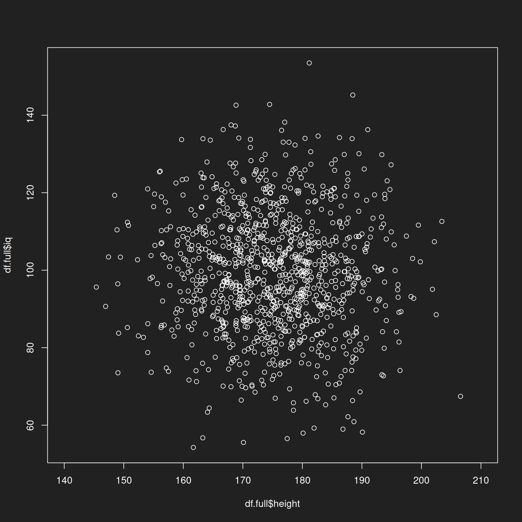
Now we display the joint distribution of both variables and approach the reference class problem. Here we only have two variables (two reference classes). Beyond two dimensions the visual representation becomes very difficult so I have limited the exercise to two variables.
In this special case of two normally distributed variables we have a multivariate normal distribution.
Remember: not all features in human populations are normally distributed (e.g. income does NOT follow a normal distribution, there are many poor and only a few rich people). We only use the normal distribution to simplify the exercise.
1plot(df.full$height, df.full$iq, xlim = c(140,210))
Random Sample Link to heading
Now let us get started with sampling. We randomly select 100 rows with 100 height-IQ combinations (one for each hypothetical human), display their indices and assign the result to a new and smaller table.
1sample <- sample(1000, 100)
2print(sample)
##   [1] 285 828 653 387 608 747 552 107 625 774 449 973 365 895 595 857 167 833
##  [19]  43 346 951  31 915 194 173 966 576  50 208 716 547 321 474  81 766 537
##  [37] 697 281 505 337 806 875 929 163 521 388 459 808 296 957 883  25 184 867
##  [55] 185 477  97 748 499 985 987 976 767  83 312 432 741  22 928 374 942 622
##  [73] 490 669 454 571 556 512 612 739 373 431 791 733 267 638 932 824 609 331
##  [91] 510 900 830 919 197 862 219 236  88  32
1df.sample <- df.full[sample,]
2head(df.sample, n = 10) # Show first 10 values for demonstration purposes
##       height        iq
## 285 189.3871  83.45298
## 828 186.2624  86.23997
## 653 148.1411  82.94492
## 387 175.9926 105.41063
## 608 172.4113  88.57476
## 747 170.2870 102.15800
## 552 180.2236 101.06641
## 107 170.5710 118.27952
## 625 182.6630 108.32950
## 774 176.6808  98.40323
Let us visualize this table with the randomly selected artificial humans:
1plot(df.sample$height, df.sample$iq, xlim = c(140,210))
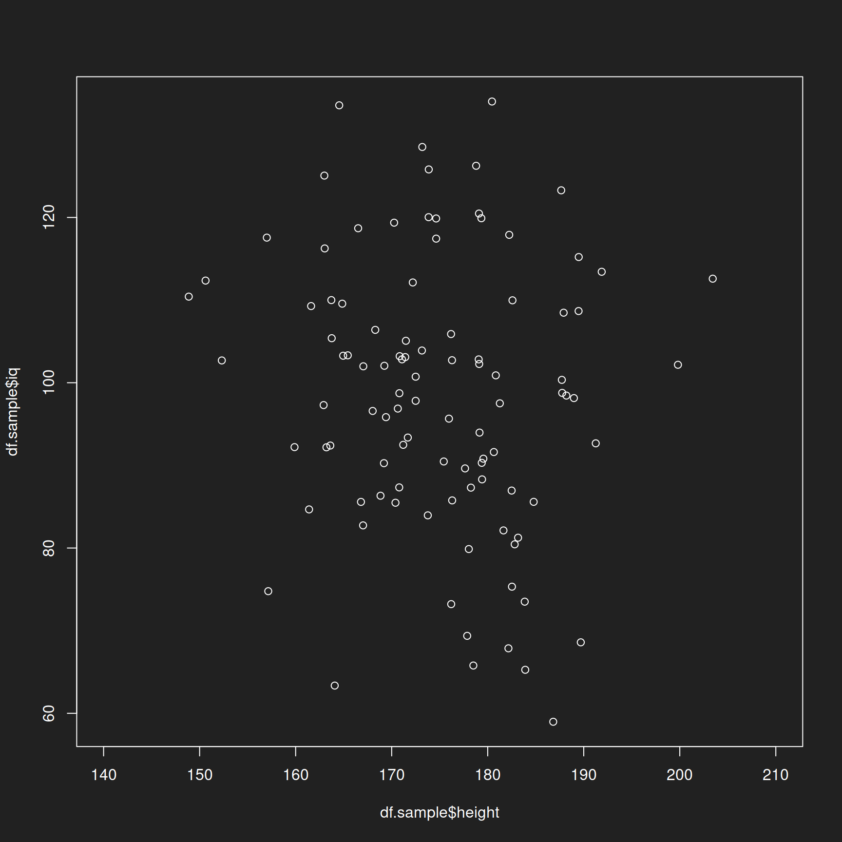
On both axes (height and IQ), examined singly and jointly, the random sample looks to be quite representative of the population, no?
Convenience Sample Link to heading
We draw another sample, but this time we bias it on purpose. Instead of selecting rows randomly, we sort the table by height and choose the 100 tallest hypothetical humans. Is this fair? Consider top management meetings. You will not only see a very large percentage of men, but particularly tall men at that (Lindqvist 2012).
1df.full <- df.full[order(-height),]
2df.convenience <- df.full[1:100,]
Let us visualize this sample and color it red to ensure that you remember it as being biased.
1plot(df.convenience$height, df.convenience$iq, xlim = c(140,210), col = "red")
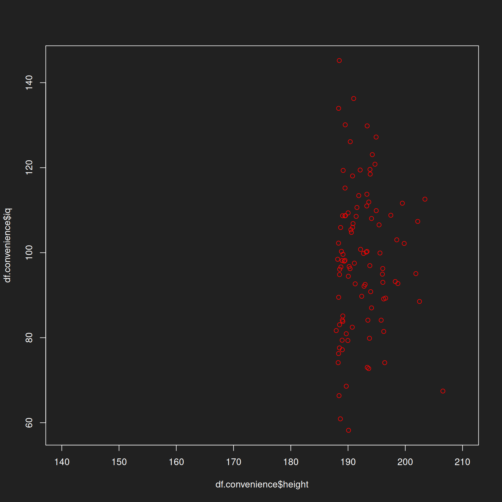
In this hypothetical example the variables are uncorrelated (i.e. their values are not dependent on each other) to simplify the exercise. In reality both IQ and height appear to be weakly correlated.
If there is a correlation between two variables (e.g. height and income) this biased sampling technique would also cause bias in the other variable. In other words, if you survey the 100 tallest people you can find, it will not help you much in discovering the representative salary within a company.
A Numerical Approach to Random Samples Link to heading
Generate Artificial Populations Link to heading
After we explored the the idea of a random sample with graphical tools, now we approach it with numbers.
We generate two classical distributions: a normal distribution and a log-normal distribution. You should remember these from the tutorial Distributions and Summary Statistics. These distributions will be our statistical populations from which we draw samples. The normal distribution is the same as from the previous section with the height and IQ examples.
This time we generate populations with 10,000 values because we no longer need to visualize the raw data.
1# Normal distribution
2normal <- rnorm(10000, mean = 100, sd = 15)
3
4# Log-normal distribution
5lognorm <- rlnorm(10000, meanlog = 4.47, sdlog = 0.5)
Visualize the Distributions of the Population Data Link to heading
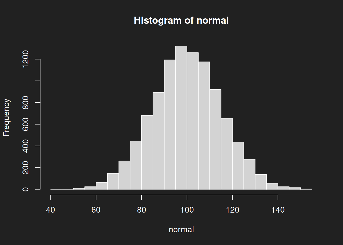
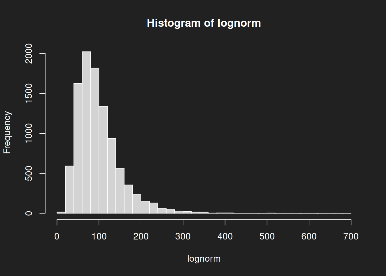
Let us create some histograms of the raw data, this will help with interpretation. The normal distribution is symmetrical with a clear mean, but the log-normal distribution is heavily skewed with no clear measure of central tendency. You can image the problems this is going to cause us in a moment.
1hist(normal, breaks = 30)
1hist(lognorm, breaks = 30)
Means of the Population Data Link to heading
In this part of the tutorial we will be using the arithmetic mean, also called the average.
We’ve learned from the diagrams that the mean can describe the central tendency of a normal distribution fairly well. It can also provide reasonable information on the log-normal distribution, although outliers affect it somewhat.
Synthetic data provides us with an important advantage: we know the true means of the population data and can use them to later evaluate the quality of our samples. We calculate them with mean().
1mean(normal)
## [1] 100.0325
1mean(lognorm)
## [1] 99.41318
Mean of a Sample from the Normal Distribution Link to heading
We draw random samples from the population, calculate the mean of the sample and compare it with the mean of the population. The closer we are to the true population mean, the better our sample.
sample(normal, 100)selects 100 random values from the populationmean()calculates the mean
I haved nested the two functions so that you can execute everything in a single line of code. The technical term is function composition.
Try executing each line multiple times! It will draw a new sample every time and the results will change slightly. You can use this to simulate multiple draws and how close your sample mean is to the population mean. I have executed the code five times in a row so you can see the sampling variability at work.
1mean(sample(normal, 100))
## [1] 98.94386
1mean(sample(normal, 100))
## [1] 100.9105
1mean(sample(normal, 100))
## [1] 98.49106
1mean(sample(normal, 100))
## [1] 99.00928
1mean(sample(normal, 100))
## [1] 98.26717
Considering the sample is only 100 values out 10,000 the results are pretty good!
Mean of a Sample from the Log-Normal Distribution Link to heading
Now we do the same for the log-normal distribution. In this case estimating the mean is more difficult because the distribution is skewed.
Try executing each line multiple times!
1mean(sample(lognorm, 100))
## [1] 94.93439
1mean(sample(lognorm, 100))
## [1] 93.48547
1mean(sample(lognorm, 100))
## [1] 104.029
1mean(sample(lognorm, 100))
## [1] 93.25974
1mean(sample(lognorm, 100))
## [1] 99.08924
The sample means from the log-normal distribution are not as close to the true mean of 99.4131752 as those of the normal distribution samples. With non-normal distributions we need a larger sample size to provide a good estimate of the population mean.
If we repeat the process with a sample size of 1,000 the estimate will be much better!
1mean(sample(lognorm, 1000))
## [1] 97.73481
Recall the true mean of the log-normal population:
1mean(lognorm)
## [1] 99.41318
Convenience Samples Link to heading
If we use convenience samples instead of random samples the estimate will be quite terrible. For example, we could select only the 100 highest values.
 1# Sort distributions
 2normal.sort <- sort(normal)
 3lognorm.sort <- sort(lognorm)
 4
 5# Select 100 highest values
 6normal.opportunity <- tail(normal.sort, n = 100)
 7lognorm.opportunity <- tail(lognorm.sort, n = 100)
 8
 9# Calculate mean
10mean(normal.opportunity)
## [1] 140.7066
1mean(lognorm.opportunity)
## [1] 326.0247
This example is a bit contrived, but it gets the point across.
The real problem with non-random samples is that we often just don’t know how biased they are. Hoping that the sample is somehow “well-mixed” or something is not proper statistical method but a recipe for disaster.
Summary Link to heading
We’ve drawn random samples and convenience samples from synthetic populations. The random samples estimate the mean quite well (normal distribution) or reasonably well if the sample size is large enough (log-normal distribution).
Non-probabiity samples, in particular convenience samples, can exhbit significant bias. The real problem is that we simply do not know how biased they are.
The Bootstrap Method Link to heading
Introduction Link to heading
We’ve seen how multiple samples from the same distribution never quite hit the true population mean. However, as sample size increases, variation goes down.
But what if we only have a single sample and are unable to acquire more, because we have no money and no time? How can we know if our sample size is sufficient?
The Bootstrap Method (Efron 1979) is an extension of what we have discussed so far and one of the most impressive statistical inventions ever. The bootstrap method is sometimes also called the Münchhausen Method, because the technique is reminiscent of Baron Münchhausen who infamously claimed to have pulled himself out of a swamp by his own hair, a feat that is as impossible as pulling oneself up by one’s own bootstraps.
I’ve opted to discuss the bootstrap method instead of classical statistical techniques like the t-test because the bootstrap does not require explaining any complicated math, is easier to try for yourself and possesses a number of theoretical advantages. In particular, the bootstrap can be used not just for estimating the mean, but also with many other summary statistics such as the median, quartiles or standard deviations.
Perhaps you remember the irritating urn-drawing examples from high school? The ones where you draw colored balls from an urn and put them back before drawing more balls? No one uses urns in real life statstics, but the concept of resampling is the foundation of the bootstrap.
This is the gist of the method:
- The basis of the bootstrap is a random sample taken from the target population.
- From this random sample we draw further random samples (!) but with full replacement. (remember the annoying urns from high school!). We call these new samples bootstrap samples or resamples.
- From each bootstrap sample we calculate a summary statistic such as the mean or median.
- The many individual summary values from step 3 are then summarized as a distribution. This allows us to quantify the uncertainty of our estimate of the true population mean.
In contrast to our earlier sampling based on multiple samples, the bootstrap method was specifically developed for cases in which no further samples could be drawn from the target population and only a single sample is available.
Why does this work? We use the original random sample from the population as a substitute population under the assumption that the variance in the sample is similar to that in the true population. Drawing many resamples allows us to quantify the uncertainty of our true population parameter estimate.
Draw Random Sample Link to heading
As first step of the bootstrap, let us draw two random samples with two different sample sizes:
- N = 100
- N = 1000
The two different sample sizes will show us the different quality of the estimates. We will again use the log-normal distribution as the target population because it is more difficult to work with and highlights the effect of increasing sample size better than the normal distribution does.
1sample.random100 <- sample(lognorm, size = 100)
2sample.random1000 <- sample(lognorm, size = 1000)
Run Bootstrap Link to heading
The bootstrap code is a little more complicated, but not terribly so.
sample(sample.random100, size = 100, replace = TRUE)draws the individual resamplessizemust be exactly the same as the original sample sizereplace = TRUEensures that sampling is done with replacement
mean()calculates the mean of the resamplesreplicate()repeats the resampling stepn = 10000times
 1bootstrap100 <- replicate(n = 10000,
 2                                expr =  mean(sample(sample.random100,
 3                                                      size = 100,
 4                                                      replace = TRUE)))
 5
 6
 7bootstrap1000 <- replicate(n = 10000,
 8                                 expr = mean(sample(sample.random1000,
 9                                                      size = 1000,
10                                                      replace = TRUE)))
Bootstrap Histograms Link to heading
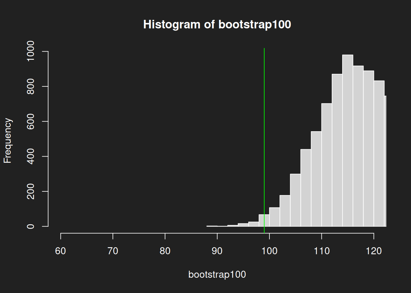
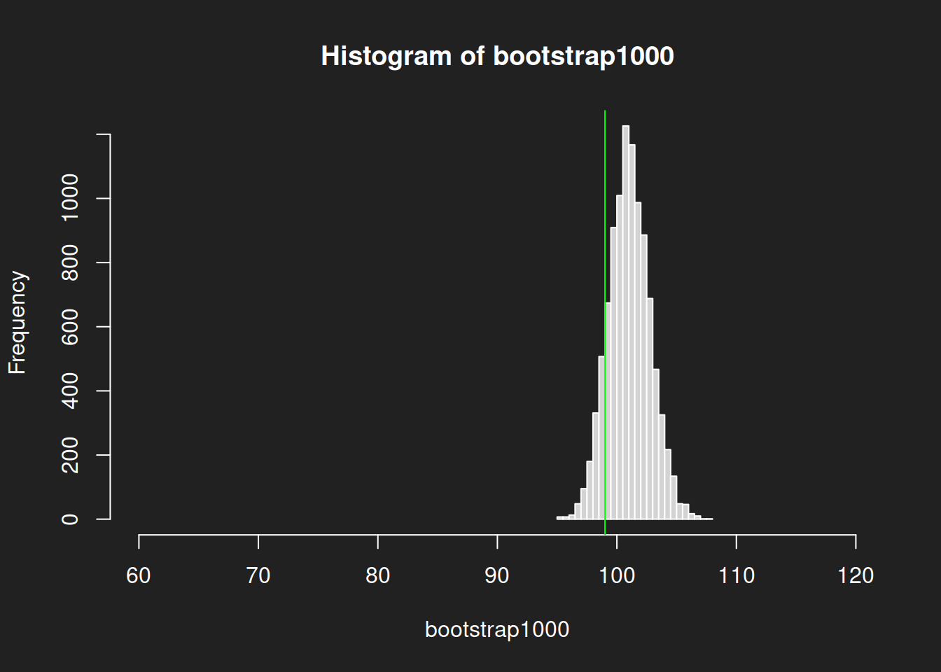
Let us review the distributions! We plot histograms for the bootstrap results from the two different sample sizes to show how much better a 1000-sample is in estimating the mean compared to a 100-sample.
We will also include the true mean of the population as a vertical line in green so we can visually evaluate the quality of the sample.
Histogram from Sample with N = 100 Link to heading
1hist(bootstrap100, breaks = 30, xlim = c(60, 120))
2abline(v = mean(lognorm), col = "green")
Histogram from Sample with N = 1000 Link to heading
1hist(bootstrap1000, breaks = 30, xlim = c(60, 120))
2abline(v = mean(lognorm), col = "green")
Summary Bootstrap Histograms Link to heading
We can see quite clearly how the center of the size-1000 histogram is much closer to the true mean and that it is much narrower with less variability. The size-100 histogram shows much more uncertainty.
Bootstrap Boxplots Link to heading
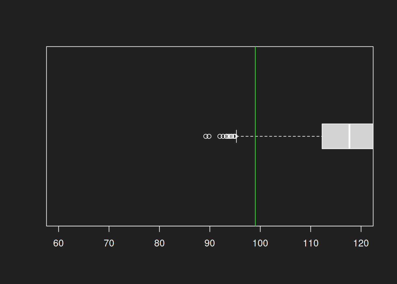
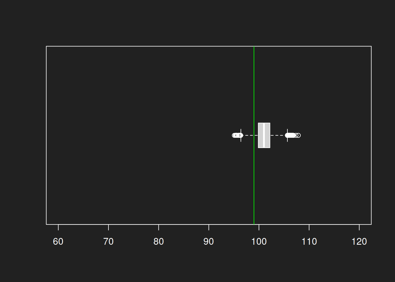
The same analyis can be done with box plots. I prefer the histograms over box plots because they show the distribution of values better, but box plots also do rather well in visualizing the different levels of uncertainty between the estimates.
Box Plot from Sample with N = 100 Link to heading
1boxplot(bootstrap100, horizontal = TRUE, boxwex = 0.3, ylim = c(60, 120))
2abline(v = mean(lognorm), col = "green")
Box Plot from Sample with N = 1000 Link to heading
1boxplot(bootstrap1000, horizontal = TRUE, boxwex = 0.3, ylim = c(60, 120))
2abline(v = mean(lognorm), col = "green")
Summary Bootstrap Box Plots Link to heading
The box plots show the same result as the histograms: a much lower uncertainty for size-1000 sample compared to a size-100 sample. Even with a log-normal distribution we can estimate the mean quite well and the variance is also much smaller. And all this with a single original sample!
Tutorial Summary Link to heading
In this tutorial we learned a lot about samples, populations and representativeness.
We learned about statistical populations (not necessarily the same as human populations!) as the set of all units that are relevant to a research question. Samples are a subset of the target population. A properly drawn representative sample allows us to infer characteristics of the target population with some uncertainty.
High-quality representativeness requires random sampling. Statistical adjustments can be applied to well-defined problems by experts but remain risky. The reason for this is the reference class problem: each unit can be assigned an infinite number of reference classes (features). Discovering all relevant features is usually impossible and usually only random samples can assure a representative distribution of features within the sample.
That being said, the ideal of random sampling is rarely achieved in practice, with non-response bias a significant challenge in modern-day opinion polling.
We learned about the rise and fall of the Literary Digest, a magazine that conducted a Presidential poll that — despite its massive sample of size of 2.27 million returned straw ballots — led to a clearly wrong result due to non-response bias and sampling bias. Due to this mistake the magazine lost its reputation and closed its doors forever.
We examined the intuition of random samples visually and compared them to convenience samples. We then explored random samples numerically. We learned that random samples work well in principle and can establish representativeness regardless of the specific research question.
Towards the end we tried the bootstrap method to evaluate the uncertainty levels of different sample sizes. A sample size of N = 100 doesn’t estimate the mean very well in our log-normal population and shows notable variance in the bootstrap distribution. However, with a sample size of N = 1,000 we can estimate the mean quite well and our uncertainty is much smaller. This acceptable level of uncertainty combined with practical feasibility is the reason that most representative opinion polls use a sample size of around 1,000.
This was a very long tutorial, but you made it to the end. Congratulations!
References Link to heading
Bryson, Maurice C. 1976. “The Literary Digest Poll: Making of a Statistical Myth.” The American Statistician 30 (4): 184–85. https://doi.org/10.2307/2683758.
Efron, Bradley. 1979. “Bootstrap Methods: Another Look at the Jackknife.” The Annals of Statistics 7 (1): 1–26. https://doi.org/10.1214/aos/1176344552.
Gelman, Andrew, and Christian Hennig. 2017. “Beyond Subjective and Objective in Statistics.” Journal of the Royal Statistical Society Series A: Statistics in Society 180 (4): 967–1033. https://doi.org/10.1111/rssa.12276.
Kaplan, Robert M, David A Chambers, and Russell E Glasgow. 2014. “Big Data and Large Sample Size: A Cautionary Note on the Potential for Bias.” Clinical and Translational Science 7 (4): 342–46. https://doi.org/10.1111/cts.12178.
Lindqvist, Erik. 2012. “Height and Leadership.” Review of Economics and Statistics 94 (4): 1191–96. https://doi.org/https://doi.org/10.1162/REST_a_00239.
Squire, Peverill. 1988. “Why the 1936 Literary Digest Poll Failed.” Public Opinion Quarterly 52 (1): 125–33. https://doi.org/10.1086/269085.
Student. 1908. “The Probable Error of a Mean.” Biometrika 6 (1): 1–25. https://doi.org/10.2307/2331554.
Wang, Wei, David Rothschild, Sharad Goel, and Andrew Gelman. 2015. “Forecasting Elections with Non-Representative Polls.” International Journal of Forecasting 31 (3): 980–91. https://doi.org/10.1016/j.ijforecast.2014.06.001.
-
In 1936 there were only 48 states in the US. Alaska und Hawaii kamen joined in 1959. Today the US is composed of 50 states. ↩︎
-
Convenience sampling is an eternal malpractice in undergraduate and even graduate social science theses. I’ve lost count of how often a student has asked me, their friends and their family via social media to spare just 10 minutes to participate in an online survey for their thesis. I absolutely understand that people need hands-on practice in conducting surveys, but not at the price of teaching them an “anything goes” sampling mentality. ↩︎
-
There are distributions that cannot be estimated well with the usual inferential statistical procedures. This is because of the Central Limit Theorem, which is only applicable if the mean and standard deviation are both defined and finite. The Cauchy Distribution is a well-known exception. Since the true distribution of a population feature is usually unknown, I assume that most statisticians simply pray that their variable of interested isn’t Cauchy distributed or something. ↩︎