Distributions and Summary Statistics
Overview Link to heading
Our understanding of reality in the modern world is largely mediated through the analysis and interpretation of data. COVID-19, climate change, artificial intelligence, mass claims — many complex phenomena cannot be properly understood or managed without assistance from massive data sets. At this point the purely literary methods of traditional doctrinal analysis reach their limit.
Beyond a certain size, data sets are not intelligible to humans anymore.1 This threshold is rather low — even a few dozen data points are sufficient. This is why data sets are approached with statistical methods, in order to summarize and reduce them to a form that is understandable and usable by humans.
At first glance Summary statistics appear to offer a persuasive and objective mathematical clarity. The arithmetic mean (also ‘average’ or just ‘mean’) is one of the most popular summary statistics. The mean is easy to understand, easy to apply and widely used. Regrettably, the mindless application of the mean often leads to biased results, ignorance of diversity and an exclusive focus on unrealistic ideals (recall the ‘average citizen’ rhetoric in political discourse).
In this tutorial we will discuss several methods of summarizing data. First with synthetic data, then with a ‘real’ legal dataset:
- Summary statistics (mean, median, quartiles)2
- Distributions (histogram, density diagram, box plot)
Distributions are better suited to summarizing data fairly because less information is lost compared to summary statistics. Additionally, in data sets with a large number of data points there is often not just the one characteristic summary statistic, but multiple characteristic ranges and tendencies.
Table of Contents Link to heading
Variability and Uncertainty Link to heading
Distributions model two concepts much better than summary statistics: variability and uncertainty.
Variability is everywhere in the world. Even if the average male in the United States is 1.75 m, the actual range and distribution of height in the country is very diverse. Many males be close to 1.75 m, but some may be taller or shorter, and fewer than that may be much taller or much shorter. The difference in mean height between men and women is also relevant and determines the position of the entire distribution.
Uncertainty is present when our knowledge of reality is limited, irrespective of its variability. For example, a bank robber may measure exactly 1.90 m in height, but witnesses may only be able to describe him as ‘between 1.80 m and 2.00 m’ because of the stressful situation and bias in human perception. Maybe they would simply describe him as ‘very tall’.
Variability is a property of reality (ontological), uncertainty is a property of knowledge (epistemic). Both can occur at the same time. The calculation and visualization of distributions allows us to confront variability and uncertainty in a rational manner.
Preparation Link to heading
We will use the programming language R to generate, analyze and visualize data. All of the code is presented so that you can enter it line-by-line into your R console and execute it yourself.
Give it a try! Do not just read the tutorial, but try to execute the code as well! You will be able to verify the results, better understand the details and experiment for yourself a little. Programming is only enjoyable when you do it yourself. Reading by itself is never enough.
I recommend using WebR for this tutorial.
WebR is a web application that runs directly in your browser and executes R code locally in a sandbox on your machine, not in the cloud. You do not have to install anything.
Of course you can also execute the code from the tutorial in a local integrated development environment (IDE) such as RStudio or in the cloud, for example with Posit Cloud.
Freeze Random Numbers Link to heading
1set.seed(999)
Random Number Generator
The function set.seed(999) freezes the initialization value for the random number generator. If you use this initialization you should generate the same random numbers that I am seeing. You can also ignore this line. Your results and diagrams will look slightly different, but this will not affect your learning experience.
Generate Data Link to heading
The lines of code below generate 1,000 data points each for three different classic stochastic distributions. These data points could have come from an empirical study or an opinion poll. I chose the number 1,000 because many representative opinion polls aim for a sample size of approximately 1,000 respondents and this will help you develop a feeling for statistical practice.
Here we practice with three idealized distributions to simplify and exemplify methodology:
- Simplification, because we can avoid all the code for downloading and ingesting data
- Exemplification, because each of these distributions possesses certain characteristic properties that exemplify typical problems with analysis and interpretation
We will analyze these distributions soon, I promise!
Normal Distribution Link to heading
1normal <- rnorm(1000, mean = 100, sd = 15)
Log-Normal Distribution Link to heading
1lognormal <- rlnorm(1000, meanlog = 4.47, sdlog = 0.5)
Beta Distribution Link to heading
1beta <- rbeta(1000, 0.2, 0.2) * 190
Show Values of Distributions Link to heading
Let us attempt to display the values for each distribution. Displaying raw values is a good idea for small data sets (and sometimes for larger ones as well) because you may be able to immediately recognize certain patterns and develop hypotheses or ideas for further exploration of the data. If there are serious data errors you may be able to recognize them at this stage as well.
The bracket suffix [1:50] limits the display to the first 50 data points. I chose this limitation to avoid making you scroll through an ocean of data to reach the next section. With larger data sets, displaying all data points will flood the R console and the interface may freeze or crash. Fortunately, this is improbable with only 1,000 data points. Unless you have a very, very old computer.
Show Normal Distribution Values Link to heading
1print(normal[1:50])
1##  [1]  95.77390  80.31161 111.92776 104.05106  95.84040  91.50964  71.82013
2##  [8]  80.99813  85.48375  83.18486 119.88196 102.00966 114.08124 102.58807
3## [15] 114.36476  79.55971 101.02503 101.50986 113.52017  68.88464  81.57155
4## [22] 109.64566  94.60356 104.41053  83.12097 109.63398  83.39894  86.72739
5## [29]  76.68857  98.09982 135.73996 109.01914 102.69042 116.20797  96.29782
6## [36]  68.29395  94.44209 107.84302 107.76708  78.96234  92.71545 100.12747
7## [43]  80.76830  83.32632 104.50998 104.14718  69.23684 100.21285 108.73400
8## [50]  99.47910
Try displaying the data without the limit! Instead of print(normal[1:50]) simply enter print(normal) or set different limits from 1:50!
Only once you have flooded your console by accident you will realize how futile the manual inspection of some data sets can be. At least your system won’t crash from showing these 1,000 data points.
Show Log-Normal Distribution Values Link to heading
1print(lognormal[1:50])
1##  [1]  85.12648 257.71340  48.41812 140.10341 136.86963  34.38457 151.97229
2##  [8] 169.33980  84.81856  50.08362 138.04280 169.14846 186.62926 127.13527
3## [15]  44.42033  51.78645 107.27701 221.26954  66.90303  42.03478  96.06316
4## [22] 107.17145  51.65440  41.74021  65.47462 211.78821  41.83182  97.50702
5## [29]  60.25510 107.93089  67.23228 202.07011 160.05965  74.40073 111.34302
6## [36] 131.56600  70.06619  72.66396 115.78188  82.68581  75.36887 118.73016
7## [43]  65.71656  99.97671  60.43055 176.53575  61.78021  72.46802  98.20388
8## [50]  49.97018
Show Beta Distribution Values Link to heading
1print(beta[1:50])
 1##  [1] 1.820029e+02 1.180641e+01 1.899884e+02 1.363032e+02 1.367371e+01
 2##  [6] 1.092780e+02 2.324482e+01 1.790829e+02 4.682861e+01 1.899997e+02
 3## [11] 1.029877e+02 2.068828e+00 1.758332e+02 1.136942e+01 1.895999e+02
 4## [16] 1.461639e+01 1.801766e-02 4.144685e-05 1.899997e+02 1.847211e+02
 5## [21] 4.433401e+01 1.027253e+02 7.646949e+01 1.664601e+02 1.843718e+01
 6## [26] 1.885473e+02 1.644399e+02 2.383747e-01 2.190459e-05 2.669806e+01
 7## [31] 1.788748e+02 7.946888e+00 1.198917e+01 1.900000e+02 1.840867e+02
 8## [36] 1.718406e+02 1.323951e+02 9.033565e+01 1.833539e+02 1.900000e+02
 9## [41] 1.899991e+02 1.898603e+02 8.795029e+01 1.154381e+01 7.248238e-02
10## [46] 1.022053e+01 6.038260e+01 9.061349e-03 1.872870e+01 1.076143e+02
Result Link to heading
A real mess. No insights, right? As a matter of fact, there are patterns in the data, we just have no hope of recognizing them in this jumbled confusion of raw data.
Histograms Link to heading
First order of business for any new data set: visualize it. Histograms are one of the most important visual tools for summarizing quantitative data.
Histograms divide the full range of a quantitative variable into evenly sized bins and count the number of data points in these bins. Bins could also be described as ‘intervals’ or ‘subdivisions’.
Histograms are a great way to get a first impression of the distribution of a quantitative variable.
Histogram: Normal Distribution Link to heading
1hist(normal, breaks = 20)
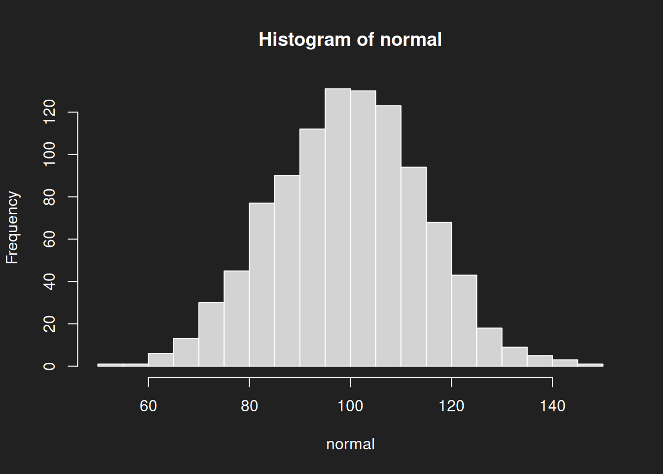
breaks = 20 sets the number of bins to be displayed. Try parameter values that are different from 20 and observe how the histogram changes!We immediately see the typical signs of a normal distribution:
- Symmetry around the mean
- A great many data points in the center
- Progressively fewer data points as we move farther away from the center
A normal distribution has only one peak: we call it unimodal.
Due to its bell shape the normal distribution is also known as the ‘bell curve’ or the ‘Gauss distribution’ (named after Carl Friedrich Gauss). It is often (but not always!) observed in nature. For example, human height is approximately normally distributed.
The Intelligence Quotient (IQ) is modeled as a normal distribution with a mean of 100 and a standard deviation of 15. In the case of IQ the normal distribution is due to convention and continuous standardization.3 If you look closely at the parameters above you will notice that I chose this normal distribution with mean 100 and standard deviation 15 as our study example.
Standard Deviation
The standard deviation is the mean distance of all data points from the overall mean. In other words: each data point possesses a certain distance to the mean. The standard deviation is the mean of these distances. We will not spend much time on this, but the standard deviation is an important statistic and is affected by similar problems as the regular mean.
Histogram: Log-Normal Distribution Link to heading
1hist(lognormal, breaks = 20)
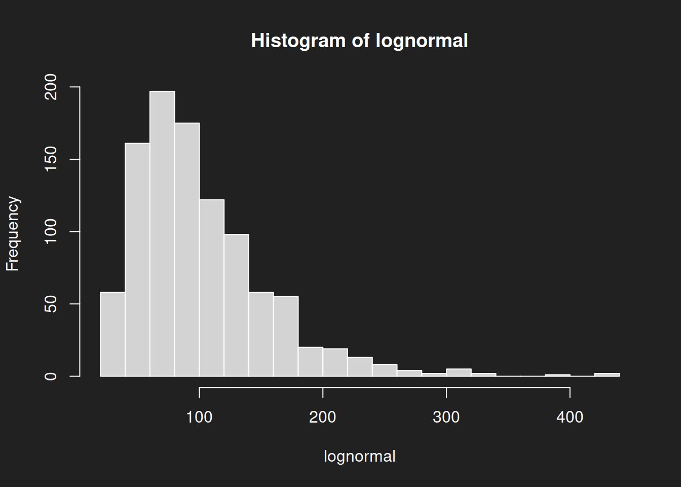
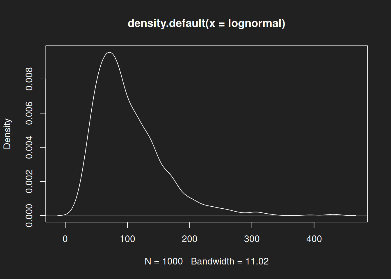
The log-normal distribution with our chosen parameters is visibly different from the normal distribution. Specifically: it is skewed. When the center is on the left side as it is here, we call it ‘right-skewed’. Odd, but this is the way it is.
Histogram: Beta Distribution Link to heading
1hist(beta, breaks = 20)
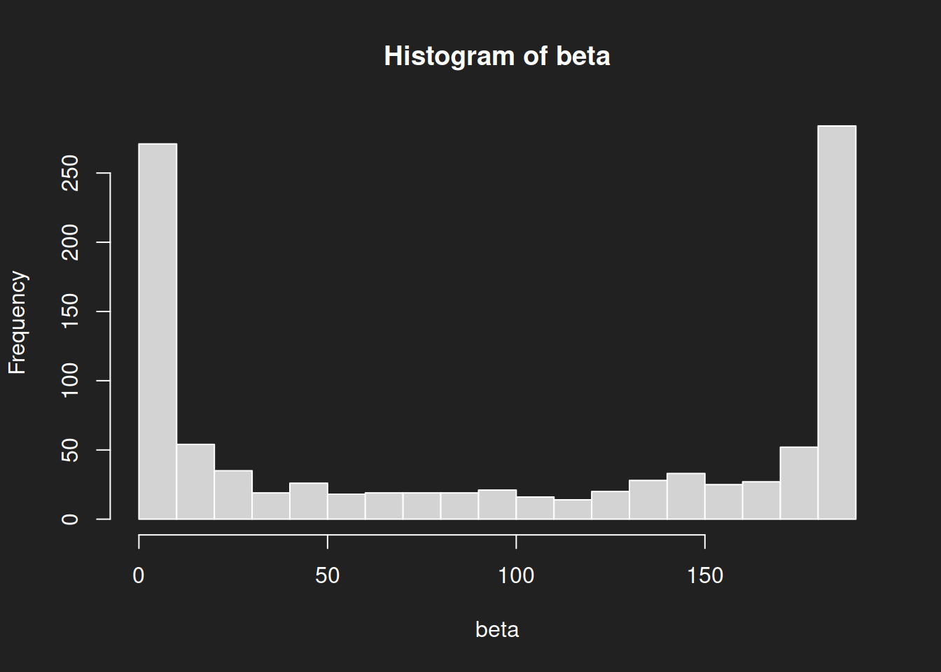
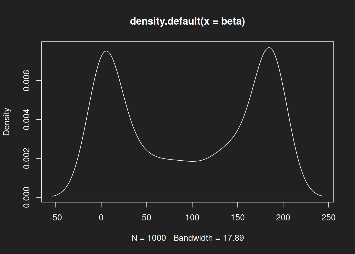
The shape of the beta distribution in our example is wholly different from the normal distribution or the log-normal distribution. In particular: there are two peaks, we therefore call it bimodal.
Beta distributions can take rather exotic forms. Take a look at the different parameterizations on Wikipedia.
Recap: Histograms Link to heading
Three different distributions, three markedly different shapes.
The mean is a reasonably good description of the central tendeny of a normal distribution, a not-so-good description of this particular log-normal distribution and a terrible fit for this particular beta distribution.
Many failures to interpret the mean appropriately are based on the implicit assumption that it represents the center of a normal distribution and is reasonably representative of the data (the famed ‘average citizen’). Even where the underlying distribution is at least approximately normal in truth, the over-reliance on the mean may result in significant day-to-day problems for non-average people (consider tall people and the ever-shrinking size of seating in economy class on airplanes).
However, there often is no underlying normal distribution. Perhaps the data follows a beta distribution, or a log-normal distribution, or a gamma distribution or something even more exotic. Unless you know for certain, be cautious of assuming a normal distribution when interpreting the mean.
Families of Distributions
Not all normal, log-normal and beta distributions appear as I have shown them here. In fact, they are families of distributions and individual distributions must be specified by choosing parameters such as the mean or the standard deviation. For example, a different log-normal distribution might be left-skewed.
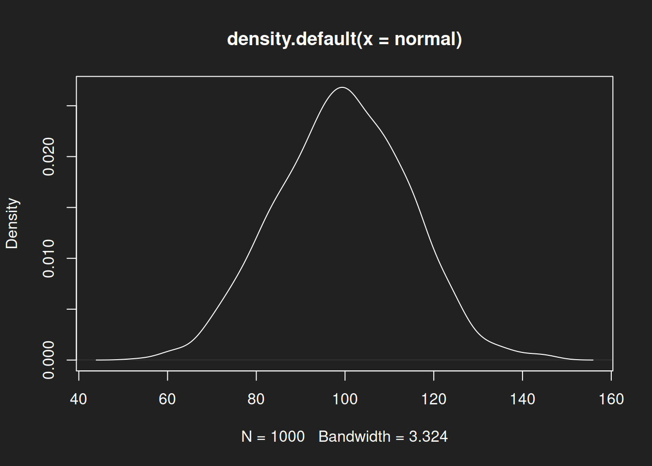
Density Diagrams Link to heading
Density diagrams are refinements of histograms. You could call them fluid histograms, where bins continuously flow into each other. I usually prefer density diagrams over histograms in my own work because then I don’t have to worry about the number of bins and results are quickly interpretable.
Density Diagram: Normal Distribution Link to heading
1plot(density(normal))
Density Diagram: Log-Normal Distribution Link to heading
1plot(density(lognormal))
Density Diagram: Beta Distribution Link to heading
1plot(density(beta))
Recap: Density Diagrams Link to heading
As with the histograms, we see a symmetric distribution with a single peak for the normal distribution, then an asymmetric right-skewed log-normal distribution and finally a symmetric but bimodal beta distribution.
Summary Statistics Link to heading
You can quickly calculate six key statistics for a dataset with the very comfortable function summary(). It provides the following output:
| Statistic | Description |
|---|---|
| Minimum | The smallest value in the data set. |
| 1st Quartile | 1/4 of values are smaller than this statistic, 3/4 are larger. |
| Median | Half of all data points are smaller than the median, half are larger. |
| Mean | The sum of all data points, divided by the number of data points. |
| 3rd Quartile | 3/4 of values are smaller than this statistic, 1/4 are larger. |
| Maximum | The largest value in the data set. |
Five Number Summary
summary() shows six statistics. Sometimes data sets are described with a ‘five number summary’ instead, which can be calculated with fivenum() in R. We rely on summary() in this tutorial to include the mean. Note that the median is calculated differently in fivenum()
Summary Statistics: Normal Distribution Link to heading
1summary(normal)
1##    Min. 1st Qu.  Median    Mean 3rd Qu.    Max.
2##   53.90   89.42   99.86   99.51  109.55  145.92
The mean and median for a normal distribution are almost identical. Either represents a reasonable description of its center. This is the ideal that people tend to have in mind when interpreting the mean or median.
Summary Statistics: Log-Normal Distribution Link to heading
1summary(lognormal)
1##    Min. 1st Qu.  Median    Mean 3rd Qu.    Max.
2##   20.93   63.22   88.01  101.34  128.54  433.77
Mean and median for the log-normal distribution differ notably. A review of the histogram and density diagram shows that the median is a better fit for the center of the distribution. The mean is biased upwards because of outliers to the right.
Summary Statistics: Beta Distribution Link to heading
1summary(beta)
1##    Min. 1st Qu.  Median    Mean 3rd Qu.    Max.
2##   0.000   6.764  98.912  96.506 184.584 190.000
For this particular beta distribution neither the mean nor the median is an adequate measure to describe the key characteristics of the distribution. A bimodal distribution with two peaks at either end cannot be properly summarized with a single measure.
Recap: Summary Statistics Link to heading
We have created visuals and calculated summary statistics for three different distributions. Based on a comparison of diagrams and summary measures we now understand how the quality of measures of central tendency is dependent on the shape of the distribution.
Box Plots Link to heading
Box plots (or ‘box-and-whiskers plots’) are compact diagrams based on many of the summary statistics we just calculated with summary(). Since they are not entirely intuitive, the table below lists their key features:
| Statistic | Display in Box Plot |
|---|---|
| 1st Quartile | Left border of the box |
| Median | Bold line in the middle of the box |
| 3rd Quartile | Right border of the box |
| $ 1,5 \times IQR $ | The ‘whiskers’ |
| Outliers | Individual data points beyond the whiskers |
Box Plot: Normal Distribution Link to heading
1boxplot(normal, horizontal = TRUE, boxwex = 0.3)
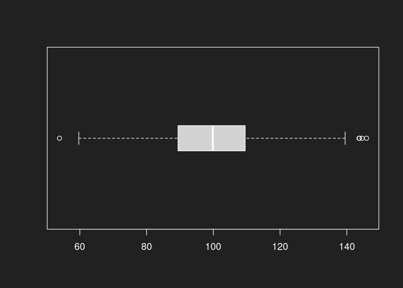
For the normal distributions a box plot offers good results. The symmetric form and the median as a description of the center create an appropriate visual.
boxwex = 0.3 simply defines the size of the displayed boxes. It has no further substantive meaning.Box Plot: Log-Normal Distribution Link to heading
1boxplot(lognormal, horizontal = TRUE, boxwex = 0.3)
The box plot is also a good visual for the log-normal distribution. This is primarily due to the center of the box being defined by the median, not by the mean.
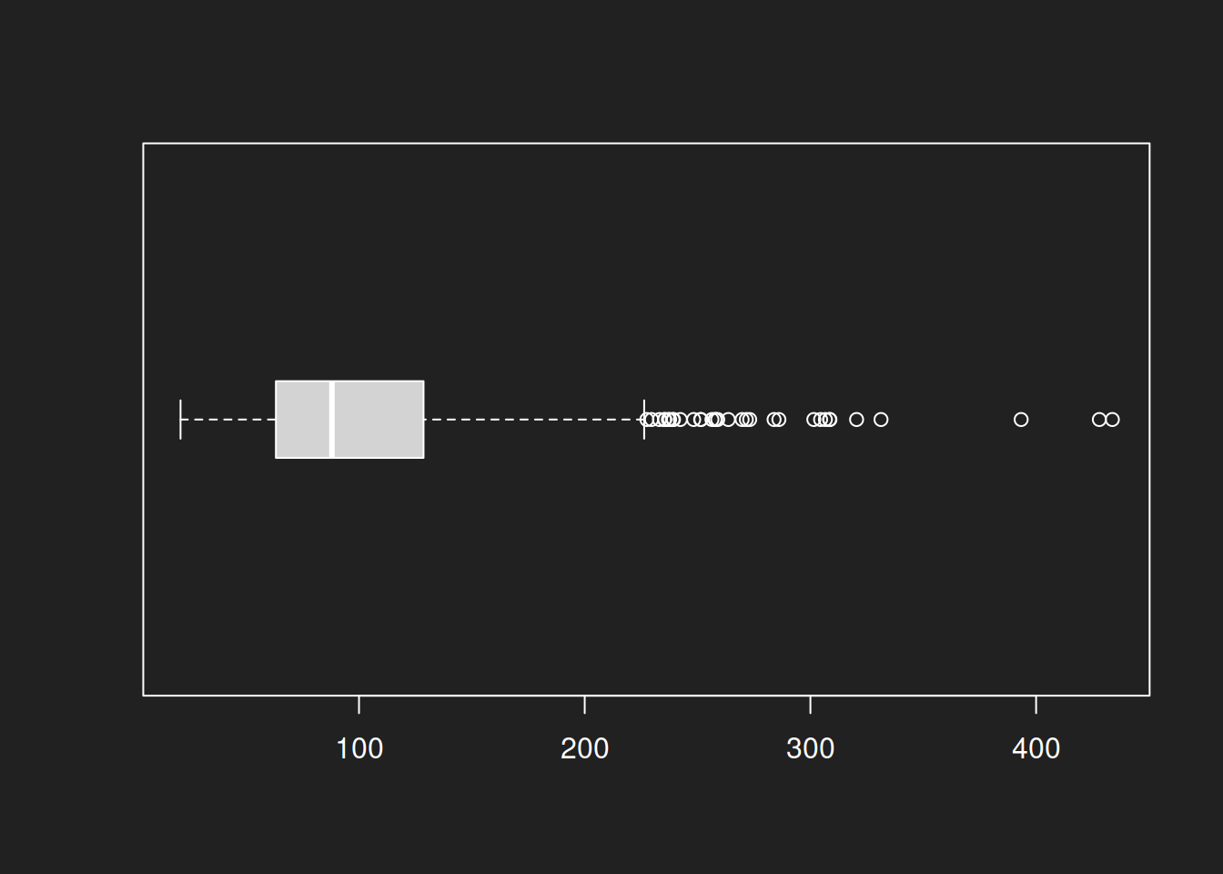
Box Plot: Beta Distribution Link to heading
1boxplot(beta, horizontal = TRUE, boxwex = 0.3)
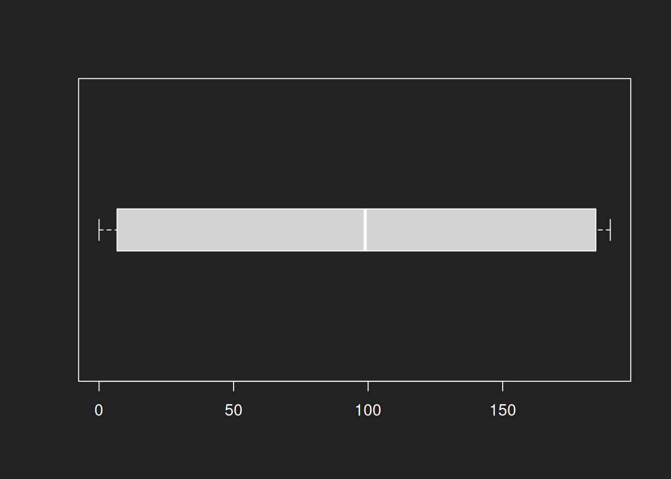
The beta distribution is again the distribution that breaks the plot. This is not surprising, as the individual summary statistics produced by summary() aren’t very useful either. A bimodal distribution simply cannot be captured well by a diagram based on these statistics.
Recap: Box Plots Link to heading
Box plots produce good results for the normal and log-normal distributions. The beta distribution diagram is mostly useless. Unsurprising, but an important lesson: always try different types of diagrams.
Practice: US Judge Ratings Link to heading
About the Data Set Link to heading
The data set USJudgeRatings comes pre-installed with R and contains various ratings for 43 US-American Superior Court judges, as assigned by attorneys (Hartigan 1977).
With ?USJudgeRatings you can learn more about the data set.
The exact source of the data is difficult to trace, so you should not over-interpret the results. That being said, the data set is quite useful for practice purposes and can give you a taste of what ‘real’ data is like.
Description of Variables Link to heading
- CONT: Number of contacts of lawyer with judge
- INTG: Judicial integrity
- DMNR: Demeanor
- DILG: Diligence
- CFMG: Case flow managing
- DECI: Prompt decisions
- PREP: Preparation for trial
- FAMI: Familiarity with law
- ORAL: Sound oral rulings
- WRIT: Sound written rulings
- PHYS: Physical ability
- RTEN: Worthy of retention
Practice Link to heading
- Display the whole data set with
print(USJudgeRatings)! - Display all variables with
names(USJudgeRatings)! - Apply
summary()to individual variables of the dataset! Example:summary(USJudgeRatings$CONT). - Visualize individual variables with
hist(),plot(density())andboxplot()! - You can apply
summary()andboxplot()to entire data sets to summarize them quickly. Tryboxplot(USJudgeRatings, horizontal = TRUE, las = 1)!
Replication Details Link to heading
1sessionInfo()
 1## R version 4.2.2 Patched (2022-11-10 r83330)
 2## Platform: x86_64-pc-linux-gnu (64-bit)
 3## Running under: Debian GNU/Linux 12 (bookworm)
 4##
 5## Matrix products: default
 6## BLAS:   /usr/lib/x86_64-linux-gnu/openblas-pthread/libblas.so.3
 7## LAPACK: /usr/lib/x86_64-linux-gnu/openblas-pthread/libopenblasp-r0.3.21.so
 8##
 9## locale:
10##  [1] LC_CTYPE=en_US.UTF-8       LC_NUMERIC=C
11##  [3] LC_TIME=en_US.UTF-8        LC_COLLATE=en_US.UTF-8
12##  [5] LC_MONETARY=en_US.UTF-8    LC_MESSAGES=en_US.UTF-8
13##  [7] LC_PAPER=en_US.UTF-8       LC_NAME=C
14##  [9] LC_ADDRESS=C               LC_TELEPHONE=C
15## [11] LC_MEASUREMENT=en_US.UTF-8 LC_IDENTIFICATION=C
16##
17## attached base packages:
18## [1] stats     graphics  grDevices datasets  utils     methods   base
19##
20## other attached packages:
21## [1] knitr_1.48
22##
23## loaded via a namespace (and not attached):
24##  [1] bookdown_0.40     digest_0.6.37     R6_2.5.1          lifecycle_1.0.4
25##  [5] jsonlite_1.8.8    evaluate_0.24.0   highr_0.11        blogdown_1.19
26##  [9] cachem_1.1.0      rlang_1.1.4       cli_3.6.3         renv_1.0.7
27## [13] jquerylib_0.1.4   bslib_0.8.0       rmarkdown_2.28    tools_4.2.2
28## [17] xfun_0.47         yaml_2.3.10       fastmap_1.2.0     compiler_4.2.2
29## [21] htmltools_0.5.8.1 sass_0.4.9
-
Statistics and computers come into play as soon as the scale of data cannot be processed by humans unaided. Whenever the scale of data cannot be easily processed by standard computers we call it ‘big data’. ↩︎
-
I have excluded the mode from this tutorial to focus on the more practically important measures of central tendency. ↩︎
-
The Flynn Effect regularly moves the center of the distribution, which is why tests need to be recalibrated every so often. I believe this is affects the position of the mean and not the shape of the distribution. ↩︎